Image Manipulation
For this assignment, I designed a new book cover for The Hunger Games by Suzanne Collins. My goal was to create a cover that captures the novel’s themes of rebellion, survival, and strength. I sourced photos from Adobe Stock and created the book cover in GIMP.
I started by adjusting the background image of a forest to decrease the saturation and brightness to give it a more somber tone. I then imported an image of a female archer, removed the background, and filled it with black to create a clean silhouette. I chose to use a silhouette to emphasize Katniss’s strengths while leaving her physical appearance open to the reader’s interpretation. The light rays shining behind her further emphasize her as the main character.
I chose a bold, grungy font to reflect the grit and dark themes of the novel and added a moderate border to improve readability against the detailed background. I added a slightly transparent black box under the author’s name to add contrast and establish visual hierarchy. Finally, I added an image of a Mockingjay pin, which is a symbol closely associated with the series. I adjusted the brightness and angle of the pin to make it more visually prominent.
In this project I applied multiple digital image editing techniques including the use of alpha channels, opacity adjustments, layers, and color correction.

Logo
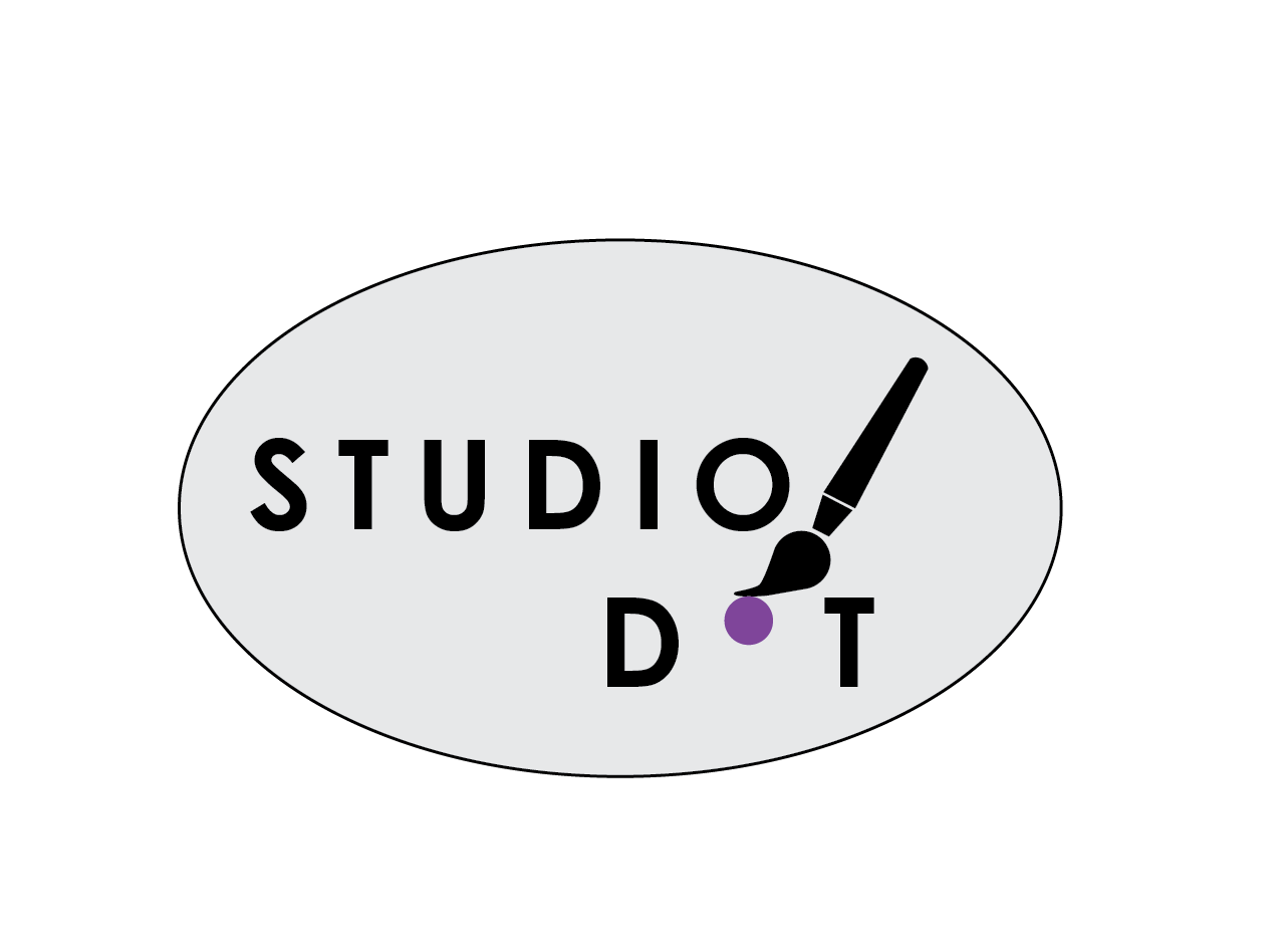
For the logo assignment, I created a design for a fictional art studio called Studio Dot using Adobe Illustrator. I chose Adobe Illustrator because it is the primary design program I use in my current role, and I know it is a reliable tool to create clean vector graphics. The main themes of Studio Dot’s brand are simplicity, creativity, and modern design. I wanted the logo to convey that there are endless creative possibilities that can emerge when starting with a blank page.
To achieve this, I selected a clean sans-serif font to reflect a modern aesthetic and placed the text vertically to establish visual hierarchy and interest. I added spacing between the letters to create a sense of openness and creativity. Using a combination of the pen and shape tools, I designed the silhouette of a paintbrush as a direct representation of artistic expression. The single purple dot below the brush reinforces the studio’s name and concept, symbolizing the idea that every creative endeavor begins with a single mark. I limited the color palette to black, gray, and purple to maintain simplicity and draw the viewer’s attention directly to the dot. A light gray oval background with a thin black border contains and unifies the logo without distracting from the main imagery.
This logo is fully scalable as a vector graphic and can be used for both print and digital marketing. It applies design principles of balance, contrast, hierarchy, alignment, and unity to create a strong brand identity. This assignment allowed me to practice using the pen tool, which I don’t use often, and gave me an opportunity to apply foundational design principles in a more intentional way. I don’t frequently get the chance to create logos in my current role, so I really enjoyed the creative freedom of this project.